5 Best Practices for Nonprofit Fundraising with QR Codes
In these past two years, you may have noticed a resurgence of something once long forgotten, QR Codes. As our phone cameras now have scanners built into them, QR codes allow audiences to seamlessly transition from print to digital and create a better experience for our donors.
While it may seem obvious for restaurants and events to use QR codes, here’s how you can successfully implement QR codes into your designs to fundraise more effectively.
Your Placement
First and foremost, where should you place the QR code? While it’s easy to get excited about throwing QR codes in everything, think about your placement. Putting a QR code anywhere the user would have to use another device to scan the code (because they’re already on their primary), is an unhelpful usage of the tool. Examples of this may include in your email or on a social media post. Our recommendation is to use QR codes in instances where your donors are being directed from print to digital. In your direct physical mail, several placement options might make sense for you. These placements may include:
The Outer Envelope: This can allow you to greet and convert the donor before they even open the appeal. However, as fundraisers seek ways to make our mail look personalized and less “junky” you’ll need to be mindful of your design. If you try to make the outer envelope appear too much like a letter from a friend, but then there is a big QR code stamped on it, it may be mistaken for junk mail.
The Reply Card: We know, your reply card is already chalked full of content. From payment information, disclosure statements, tracking codes, etc.. So why add more? The amount of content is exactly why. The QR code can give the donor, specifically the more tech-savvy ones, the chance to ignore or bypass the chaos of the reply card and streamline your donation process.
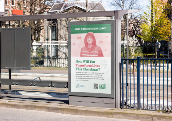
Bus Ads (OOH Ads): Bus ads, aka. Out-Of-Home (OOH) advertisements may be one of your best choices for a QR code. They can be big, loud, and scannable and meet the user where they are at.
In fact, according to Pattison, “almost 3/4 (75%) of [Canadian] consumers take action after seeing a [OOH] place-based ad; most common actions are visiting a website, seeking more product info, or watching a TV program. ”Think about it. When a user is standing waiting for a bus, they are more likely to take the time to take the immediate action of scanning the QR code then they are to memorize the URL to donate at a later time. This means more intentional and direct donations to your nonprofit.
Tips, Tricks and Design Rules
Now that you know where you want to place your QR code, consider how you integrate it into your design. The key when placing anything in your design is to ask, what purpose does it serve?To seamlessly integrate the QR code in your designs, consider creative placements that make sense with the campaign. Using unique ways to frame the QR code makes it feel like it’s part of a cohesive piece, and draws the user's eye towards it. Here are some examples Frontier has done:
Example 1: Frontier worked on a piece for the Vancouver Public Library Foundation and integrated the QR code into a book.
Example 2: Or, for a Christmas print ad for the University of Fraser Valley, we placed the code in a gift box.
In both these instances, we didn’t put a QR code on the design because we had to, but made intentional design choices to help elevate the work and draw attention to the code. Need more inspiration for creative uses? Check out Scanova’s, “QR Codes in Canada: Eight Interesting Use Cases”.
Other design considerations for your QR code:
Here are a couple other best practices Frontier follows when using QR codes:
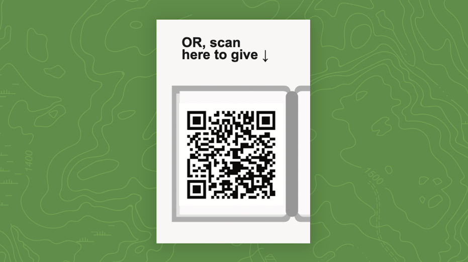
Minimum Size: While there is no formal regulation for QR codes, a minimum of .8 x .8 inches is good practice for print projects. This ensures that the code remains scannable and visible for most cameras.
Contrast: For accessibility and scannability, make sure there is a stark enough colour contrast. Your contrast ratio should be at a minimum of 4:1, with the dark colour being the QR code and the light colour being the background. Don’t know the ratio? Try using WebAIM’s Contrast Checker.
Paper Quality: Another design consideration is the choice of paper. If it is reflective or glossy, it may create too much of a glare that makes scanning difficult. Plain paper is better than a textured or glossy print for readability.
Stretching and Warping: Warping, stretching or otherwise modifying the size of the QR code from its original design will make it unscannable. Be mindful when you are pasting it in that it remains at the ratio it was designed.
Padding: Ensure you are giving enough space around your QR code so that cameras can recognize it. A good rule of thumb is .25 inches of padding around the code. If the QR code is placed close to a fold, cut or sharp line, consider leaving more padding in case anything gets misaligned in print.
The User Experience
We’ve already established that QR codes can provide a great user experience if done correctly, as they allow the audience to bypass additional steps and make an efficient donation. However, another key consideration is the experience once you get to your donation page. Does the page look similar to the design of the appeal? It should. Does it feel like a cohesive experience? It should.
If your donation page is littered with confusing pop-ups, a different brand, or it’s an overwhelming experience, you lose trust in your audience and you lose a donation. One way to avoid this is to use a program that provides a consistent visual experience. We recommend Fundraise Up for its ease of use and simple integration with your website. The other consideration is to be mindful of the colours and photography you use in your print campaign. Always make sure to replicate these on a unique landing page.
P.S. For more information on a successful digital donation page, check out Frontier’s “5 Proven Tips to Win Over Your Online Donors.”
Avoiding Errors
Dead Links
Another challenge of using QR codes are human and web errors with your URL. There is nothing worse than having the QR code’s URL off by a single digit, rendering the experience useless. Or your donor scans the QR code and is taken to everyone’s favourite 404 error page. Frontier has discovered a wonderful workaround, dynamic QR codes. Dynamic QR codes use a short URL code that redirects the user to your intended URL. This URL can be changed after the QR code is generated, but the short one remains the same–so the link will always work.
Not only does this allow you to edit the URL if there is an error, but it provides a unique advantage for fundraising opportunities. Once a targeted or seasonal campaign has ended, you can change the URL to a general donate page so the content remains evergreen. This works in instances where a campaign may take a while to be taken down, such as a bus ad after Christmas.
Test It Again
While Dynamic QR codes are a wonderful tool, the best way to make sure your QR codes work is to test them. You can do this using different phones, cameras and lighting scenarios. Our tip is to make sure the QR code works at least 5x before sending the project off to print.
Take the Data and Run With It
As any good marketer would advise, collecting and analyzing data can help you improve upon future campaigns and grow your donor base. QR codes allow for ease when collecting data from print to digital, as you can track the exact action the user took to get to your page.
When setting up a QR code, the program you chose will vary on what you can track, but if you use a custom UTM code in your link, you can collect information on:
Campaign Name
Source (i.e. Campaign Number)
Medium (i.e. Outer Envelope)
Users Location
Users Browser
Having this data helps you make better-informed decisions when building experiences for your donors.
Overall, QR codes are a unique and great tool to add to your fundraising toolkit. But, as with every decision you make, be mindful of where, why and how you integrate them into your campaigns in order to better enhance the experience for everyone.
What's your favourite QR code integration you’ve seen? Share them below or send them to me at carita@frontier.io!
Further Reading and Sources
Guide to Fundraising With QR Codes | Goodthyngs
22 Ways Nonprofits Can Use QR Codes for Fundraising and Awareness Campaigns | NP Tech for Good
QR Code Design and Use | PrePressure
40 Best Innovative Uses of QR Codes | QR Code Tiger
Data & Analytics | Pattison Outdoor


