5 Tips to Increase Online Donations
Charities run on donations, and so in this digital age it makes sense that 94% of nonprofits accept online donations through their website [2021]**. With that many nonprofits and charities employing online strategies to seek donations, we see variability in what tactics are the most successful. However, there are a couple tips and tricks that nonprofits can adopt to see an immediate increase in donations.
1: Make Your Donate Button Bigger and More Prominent
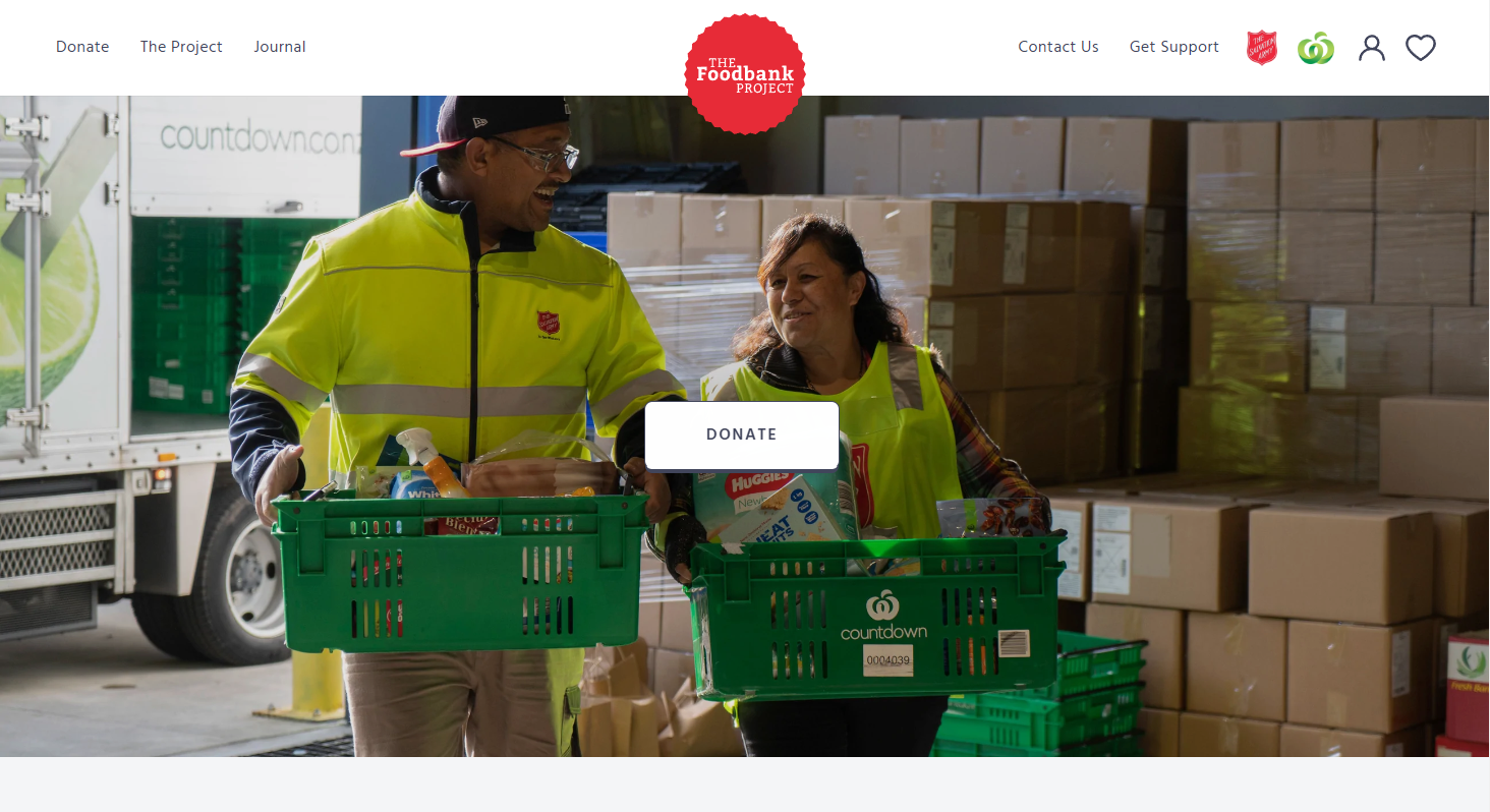
When you are designing your webpage, you know a donation button makes sense. You may feel like it’s too big, or too brash to have it so bright and centered. Don’t worry - it’s not! Chances are it could be bigger or more noticeable.
People who are navigating your website understand that you are a charity! It is expected that you are looking for donations so don’t be shy about it. Have your donate buttons prominent and often.
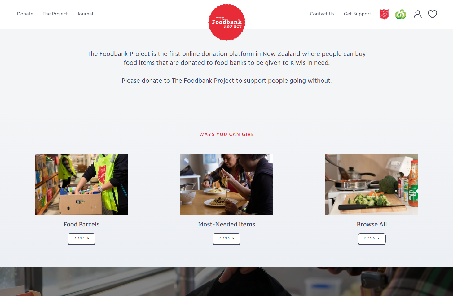
Example: The Foodbank Project
Source: https://www.foodbank.org.nz/
Your donate button should not only be on your homepage, but displayed on every page. A great way to do this is by including it in your header - often seen on the far right side. Your button can simply say “Donate” or it can also consist of other call-to-actions such as “Support Our Work”, “Help Make a Difference”, or “Give a Gift.” Keep the message concise and relevant, and try to start with an action verb.
Entice people to donate by changing up your call-to-action. If it is in the header - also consider using a different colour to help it stand out! Using “Donate” simply is always great, but if you have it several times it becomes redundant and may look excessive. Your call-to-action should be part of a story, which will help you increase online donations.
2: Tell Donors Where Their Money Is Going - On The Form!
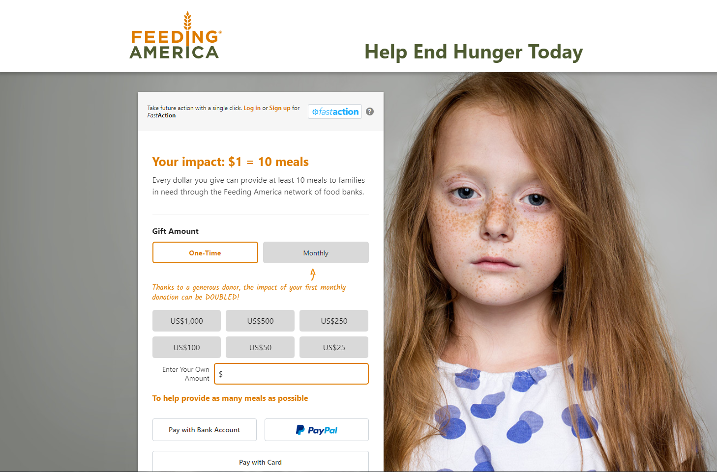
On the Feeding America website, one click takes you to the donation page. At the top of the form they clearly state where your money is going, how far each dollar goes, and they even promote monthly donations.
As a donor, you do not need to navigate away from this page to understand why your money is valuable to the organization. Having “the why” right above where you select your donation amount is very effective - it also means that someone is less likely to navigate away while filling out the form. When you are in person, it is easier to impart the urgency of your work, so in order to increase online donations, we need to convey that as much as possible on the form itself.
Feeding America’s Donation Page. Source: https://give.feedingamerica.org/a/donate
3: Consider Your Prospects’ Pathway
How is your prospective donor getting to your donation page? Did they click on a social media ad about a specific campaign or cause? Did they click on a link in an email to donate to a match campaign? Did they click a general donation link in a newsletter?
Your entrance path to making a donation must influence the page and strategy! The landing page should always match the link or image they clicked.
For example, if you are presenting a very specific ‘ask’ and then direct them to a general donation page, they may lose momentum or get distracted by any conflicting or novel information - and vice versa. Whenever possible make a donation page specific to your campaign.
On a General Donation Page you are providing organization level information, but a Campaign Donation Page allows you to contextualize your donors contribution and create continuing from the original source that encouraged them to visit the donation page in the first place!
Here are 4 ways your Campaign Donation Page should differ from a General Donation Page:
Your headline should be very specific to the previously clicked CTA
The introduction copy is closely aligned with the subject matter or cause
The body copy is a detailed narrative
Campaign specific measures such as progress charts, countdowns, and deadline
Union Gospel Mission’s Donation Page. Source: https://ugm.ca/donate.
4: Optimize Your Ask Ladder
The Ask Ladder refers to the set of suggested donation amounts found on a donation page. It allows prospective donors to easily donate one of the predetermined amounts with a simple click. This can either be done for a one time donation or to set up a monthly donation.
Choose 4 to 6 amounts, and most importantly, make sure the prices make sense for your organization. If you increase the donation amounts, you are likely to get higher donations!
The Princess Margaret Cancer Foundation. Source: https://supportthepmcf.ca/ui/DonateNow
In this example you can see that the highest set donation amount is 10x higher than the lowest. That is a big range! It also pre-selects the 2nd lowest amount rather than the lowest or none at all.
Salesforce Elevate recommends that your ask ladder starts at a base amount of 100% with each subsequent step at 150%, 200%, 400%, 800%, and 1500%.
By increasing your ask or median suggested donation, you are increasing the likelihood of receiving higher donations. Once of the biggest mistakes fundraisers make is not asking for the right number. Prospect Wisely is an AI powered fundraising and prospecting tool that analyzes your existing donor data, to generate a behavioral pattern that identifies which donors are ready to make a gift, when, and what amount they are likely to give. The tool also reminds you to communicate and follow up with them at the peak of their giving season. This way you are reaching out to the right donor, at the right time, with the right ask; accelerating your fundraising efforts.
Additionally, always make sure that you include an option for the donor to put in their own amount! This is especially important if the donor is making a donation with a personally significant amount, for example, a religiously significant nomination.
5: Keep Your Donation Form Concise
The goal is to make it as easy and simple as possible. If it becomes too cumbersome, you might lose a valuable donation.
In Canada there is a minimum amount of information required in order to issue an official donation receipt (click here to learn more).
So what is necessary? You can decide to make getting a receipt optional, in which case you don’t need to obtain their address. However, generally speaking here is what you should require from donors:
Name - First and Last
Email
Phone Number
Address
Their choice of where their money is going ** if this is something your charity offers **
Source: https://www.ymca.org/donate/form
At the YMCA there is minimal information asked, but they do include an option to receive additional communication and a drop down menu for where you would like your donation to go with a preselected option.


